
WaveScape
WaveScape SFU Redesign
Transforming large-scale mmWave network planning into a seamless, scalable experience for global telecom carriers.
+60% Faster Planning Time
-40% Fewer Errors
3x Less Support Tickets
+83% Coverage Rate
Scaling Network Planning for Suburban Complexity
When planning fixed wireless access (FWA) networks, speed and precision are everything — especially across large, suburban environments where 5G mmWave signal behavior can vary block by block.
WaveScape was already powerful for small-scale deployments, but as enterprise customers expanded to 100+ km² rollouts, the cracks started to show.
-
Users struggled to preview where coverage would succeed or fail before committing to a full run.
-
Candidate site management became overwhelming — especially without GIS support or bulk tools.
-
Most critically, the workflow wasn’t built to scale. It assumed a linear setup process in a world where engineers needed flexible experimentation and data-driven iteration.
It was clear we needed a new experience — one purpose-built for regional-scale deployments and collaborative planning cycles.
I led the end-to-end redesign of WaveScape SFU, crafting a new user journey from area definition through optimization — and aligning it with how RF engineers actually work.
Collaborative Impact
As demand surged for suburban FWA coverage, our legacy tools hit a breaking point. They struggled with large-scale planning areas, international GIS formats, and rigid, manual workflows—limiting our ability to scale.
Planners were losing time wrestling with data prep and unclear results. We needed a smarter, faster experience—purpose-built for scale, flexibility, and global deployment.
My Role
Lead UX Designer
Duration
6 months
Team
Cross-functional team of 12
(3 UX, 4 Engineering, 2 Product, 3 RF Domain Experts)
Key Responsiblities
-
Defined the end-to-end UX strategy for a new SFU planning workflow
-
Facilitated alignment across product, engineering, and RF stakeholders
-
Designed scalable site configuration and signal visualization
-
Shaped MVP scope and tradeoffs in collaboration with PM and RF leads
UX
Product
RF
Engineering
Cross-functional collaboration was essential—from system architecture to on-the-ground workflows.
The Challenge
As demand for suburban FWA grew, our current tools struggled to keep up. They weren’t designed to handle massive coverage areas, international GIS formats, or complex site workflows—especially at scale.
The Core Problem
Planning teams were spending 4–5 days on tasks that should’ve taken 2–3. The interface lacked support for bulk workflows or reusable site logic. New users took weeks to ramp up, and international teams struggled with GIS file compatibility and terrain data issues.
Operational Issues
Metrics & Friction
-
Manual site selection and prep slowed down planning
-
Projects ran 40–60% slower than expected
-
Poor GIS integration limited global use
-
3x more support tickets than similar tools
-
New users struggled with onboarding
-
User satisfaction fell in the bottom 25%
-
Legacy interface didn’t support 100+ sq km areas
-
International teams blocked by terrain data constraints
Legacy interface:
No overlays, presets, or GIS upload options—users had to input parameters blind, slowing down work and increasing support tickets.
Research & Discovery
To understand the full scope of the problem, I led foundational research with field teams to uncover real-world workflows and usability gaps. While we had a single setup flow, it became clear we were serving two very different types of users with very different needs.
Methods
23 Contextual Interviews
Conducted across 2 telecom organizations to observe planning workflows, friction points, and team dynamics
Competitive Analysis
Benchmarked 5 enterprise and adjacent planning tools to uncover UI/UX gaps and best practices
Technical Deep Dives
Collaborated closely with RF engineers and architects to understand system logic, constraints, and user edge cases
User Types & Insights
Expert RF Engineer
Needs
Full control, advanced configuration, detailed outputs
Pain
Pain: Rigid tools slowed down power users and introduced unnecessary friction
Pain
Network Planner
Needs
Guided workflows, clear progress visibility
Pain
Confusion around parameters and interpreting results
Key User Pain Points
Too many settings shown at once
Users felt overwhelmed by too many settings at once
No context preservation
Context preservation was critical for workflows that spanned multiple days
Rigid GIS support
Workflow flexibility was needed to support localized GIS data constraints
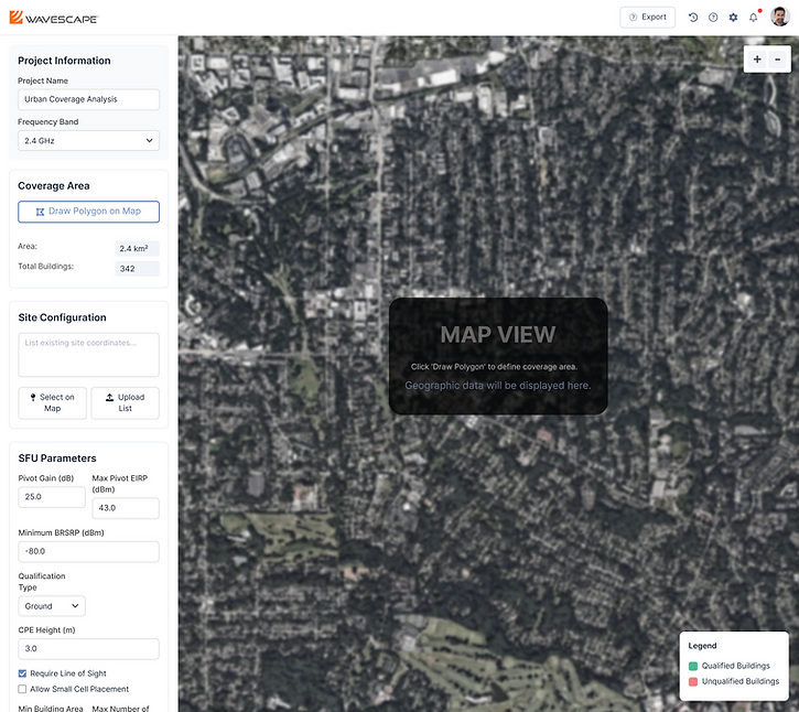
Project Information
Coverage data
Site Configuration
SFU Parameters


U.S. → “Nearmap-supported”
Germany → “KML Upload Required”
Brazil → “Terrain file workaround used”
Design Principles
Progressive Disclosure
Only reveal advanced controls when users need them, keeping the interface approachable without limiting expert capabilities.
Contextual Relevance
Surface only the tools and options relevant to the user’s current step — minimizing distractions and decision fatigue.
Workflow Continuity
Preserve user inputs and selections across multi-day sessions to support real-world planning cycles.
Design Goals
Scalable at Any Size
Support planning areas of 100+ km² without sacrificing performance — essential for suburban and regional deployments.
Clear, Guided Flow
Help users move confidently through each step of the setup process with structured progression and visible status.
Built for Flexibility
Support a wide range of configurations including GIS uploads, bulk candidate site edits, and site-specific filters.
Instant Visual Feedback
Provide immediate signal qualification overlays — reducing uncertainty and helping users iterate faster.
Workflow Redesign
The legacy SFU experience wasn’t built to scale. Users jumped between disconnected tools, struggled to configure large areas, and lacked feedback when they needed it most.
We reimagined the entire workflow as a guided, end-to-end experience — supporting international formats, flexible site configurations, and scalable deployment planning.
Redesign at a Glance
Phase
Old Experience
Redesigned Experience
Define Area
Polygon tool only, no live stats or GIS support
GIS upload, AOI stats, and fallback support for global users
Configure Sites
Rigid CSV import, no bulk edits or visual validation
Map-based selection, bulk actions, and real-time input validation
Optimization Setup
Overwhelming list of parameters with unclear impact
Guided vs Expert modes with smart presets and tooltips
View Results
Data-heavy outputs with little clarity
Visual overlays, structured insights, and exportable summaries
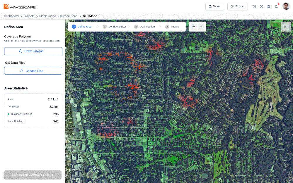
1. Define Area
The Problem
Users often drew oversized or inefficient coverage areas, blindly guessing boundaries due to a lack of feedback. This not only slowed them down but introduced significant rework. For international users, GIS compatibility was another barrier—especially when Nearmap coverage was unavailable.
Our Approach
We reimagined the entry point of the workflow to empower users with immediate insight and flexibility. By layering in contextual cues and supporting diverse GIS file types, we helped users start smarter and adapt globally.
Key Improvements
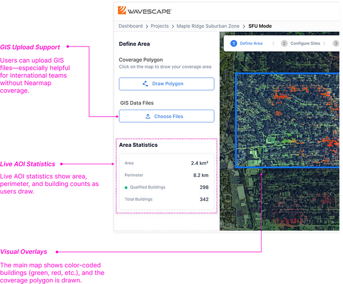
Live AOI statistics show area, perimeter, and building counts as users draw—enabling better scope estimation.
GIS upload support allows teams outside Nearmap regions to bring their own data, removing blockers for global users.
Visual overlays (qualified buildings, polygon boundaries, heatmaps) provide real-time validation for better decisions.
The Result
Users were able to confidently define target zones on the first try—saving time, reducing rework, and unlocking SFU planning for non-U.S. deployments.
2. Configure Sites
The Problem
Candidate site management was rigid and error-prone. Users had to upload CSVs with no easy way to visually select, edit, or validate sites. Any change meant going back to spreadsheets—slowing down workflows and increasing the chance of mistakes.
Our Approach
We redesigned site configuration to be map-first. Users could now select, filter, and bulk-edit sites directly within the UI. We also introduced validation cues to reduce trial and error and increase confidence before optimization.
Key Improvements
We redesigned site configuration to be map-first.
Users could now select, filter, and bulk-edit sites directly within the UI.
We also introduced validation cues to reduce trial and error and increase confidence before optimization.

The Result
Users configured sites 2–3× faster with fewer errors. The ability to fine-tune directly on the map improved precision, and first-time success rates increased—especially for large or international deployments.
3. Optimization Setup
The Problem
The legacy setup panel overwhelmed users with dozens of technical parameters—no guidance, no presets, and no clear connection to results. Even expert users struggled to predict the impact of changes, while newer users felt paralyzed.
Our Approach
We restructured the panel around a Guided vs Expert Mode toggle. Guided Mode provided smart presets and helpful tooltips, while Expert Mode gave advanced users full control. We also grouped parameters into logical categories to reduce cognitive load.
Key Improvement
Mode toggle let users switch between a simplified view and full parameter control.
Presets and tooltips guided users through configuration without external documentation.
Grouped inputs (e.g. signal, placement, cost) made the form more intuitive and faster to complete.

The Result
Both novice and expert users completed setup with greater speed and confidence. Guided Mode reduced reliance on support, and Expert Mode unlocked deeper experimentation for power users—helping teams scale planning across different skill levels.
4. View Results
The Problem
The legacy results panel was data-heavy but insight-light. Users had to interpret raw tables and disconnected layers without visual summaries or decision-ready outputs—slowing down deployment and causing confusion during stakeholder reviews.
Our Approach
We redesigned the results panel to prioritize clarity, context, and exportability. Key outcomes were visualized directly on the map (e.g., coverage overlays, LOS lines), and summaries were grouped logically for fast insight. We also made exports more useful with downloadable reports and geospatial files.
Key Improvement
Results now appear instantly on the map with qualified/unqualified buildings, coverage zones, and site relationships
Summary metrics (e.g., coverage %, cost per unit) provide quick insights for decision-making
Export tools support multiple formats (PDF, KML, CSV) for cross-team use

The Result
Users could now understand optimization outcomes at a glance and confidently share results with internal and external stakeholders. This improved decision speed and made WaveScape a more trusted tool across organizations.
Results & Measurable Impact
Quantitative Results
The WaveScape SFU redesign delivered significant, measurable improvements across all key success metrics, directly enabling strategic business initiatives and international expansion.
60%
Faster planning time improvement
Network planning projects: 5 days → 2 days average
89%
Increase in user satisfaction
User rating improved from bottom 25% to top 10% of enterprise tools
12x
International market expansion
From 1 region to 12+ international carriers supported
64%
Reduction in support ticket volume
Fewer configuration errors and user confusion
Business Value
Enabled strategic international expansion
GIS flexibility and workflow scalability opened new markets
Delivered $2.3M operational savings
Annual cost reduction through improved efficiency
Lesson Learned
By balancing usability with power and laying down scalable patterns, this project became more than a redesign—it became a foundation for future growth.
-
Expanding GIS compatibility removed regional blockers, enabling international teams to plan deployments independently—unlocking new markets and reducing support friction.
-
I’d invest more upfront in performance testing with large datasets.
-
Involving field engineers earlier would have brought key operational insight to the research phase.
-
This modular workflow is now being adopted across the broader WaveScape platform.
By balancing usability with configurability and laying down scalable patterns, this project became more than a redesign—it became a foundation for future growth.