
Pivot Dashboard
Optimizing Multi-Unit Management
The redesigned Pivot page enhances visibility for its sub units and gives engineers greater control and confidence in managing complex systems at scale.
+75% System Visibility
+35% Troubleshooting
+42% User Satisfaction
+52% Reduction In Support
The Challenge: Scaling Complexity
When Pivot 5G moved into multi-unit deployments, everything changed. Managing a single unit had been simple. Now, donor and service units tangled together into a maze that slowed engineers down and added unnecessary friction.
It was obvious the process needed to be untangled. My goal was to bring all the pieces together into one clear, intuitive system that made scaling deployments smooth, fast, and frustration free.
The daily struggles were real:
Limited Visibility:
Switching between multiple interfaces made it difficult to manage donor and service units efficiently.
Manual Configuration Hassles:
Engineers had to configure units separately, making setup tedious and error-prone.
Inefficient Troubleshooting
Troubleshooting was slow and reactive due to scattered data


The Pivot 5G now features multiple units in a single pivot, including one donor unit and up to four service units.
My Role
Collaborative Success
I led this project with the support of a dedicated team, including a PM, Product Line Manager, Principal Architect, and two developers.
As the sole person responsible for User Experience, I created all the deliverables and visual designs featured in this case study, except for development. From the initial kickoff meeting to release and beyond, I managed the project, overseeing multiple rounds of iteration to ensure a successful outcome.
Software Enginneer
Product Manager
UX
Designer
Product Line Manager
Principal Architect
Software Enginneer
User-centric approach
Transformed user insights into features aligned with behaviors and motivations.
Prototypes
Developed interactive prototypes and frameworks to define vision and strategy.
Visual Design
Collaboration
Delivered user workflows, wireframes, interactive prototypes, high-fidelity mockups, and detailed UI specifications.
Collaborated closely with developers to meet design standards in the final product.
Understanding Our Users
Leveraging Existing Personas
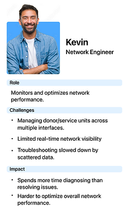
From the start, our personas have been the foundation of IBMS, ensuring every design decision stayed aligned with real user needs. Kevin (Network Engineer), Alex (Field Technician), and Arron (Support Analyst) represent the key roles interacting with IBMS every day.
As IBMS evolved, these personas remained central to guiding research and prioritization. Instead of redefining them, we focused on their existing workflows, responsibilities, and challenges to address persistent inefficiencies in the redesign.


How Personas Informed the Redesign
-
Kevin needed better visibility into real time network health and a faster, more streamlined troubleshooting process to optimize performance.
-
Alex faced inefficiencies in setup and issue tracking, requiring a more automated and integrated approach to multi unit deployments.
-
Arron struggled with too many alerts and unclear priorities, making it harder to separate critical issues from false alarms and slowing overall response times.
Grounding our research in these personas ensured the redesign tackled real workflow challenges rather than surface level fixes. These insights shaped how we validated pain points, refined system interactions, and streamlined critical workflows, as detailed in “Getting to the Root of the Problem.”
Getting to the Root of the Problem
Engineers were wrestling with complexity every day. I immersed myself in their world—watching workflows, breaking down tasks, and listening to where frustration peaked. Across technical support, RF, and systems engineering, the pain points varied, but the patterns were clear. Those insights became the blueprint for the redesign.
Approach to Discovery
I led a focused research sprint with the team, ensuring every angle was covered.


Remote sessions with technical support, RF, and systems engineers revealed where daily workflows broke down.
User Observation
Shadowed engineers in real workflows to spot repetitive steps and manual configurations that slowed them down. Many of these issues were not revealed in conversation alone.
Task Analysis
Ran task-based studies to track key actions and time metrics, exposing the exact points where efficiency broke down.
User Feedback
Held post task interviews to confirm pain points and surface new opportunities, validating patterns seen in the field.

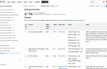
Existing system screen used in task analysis to pinpoint inefficiencies and moments of user friction.
Validating the Findings
Building on our research observations, we analyzed survey responses and support tickets to quantify the challenges.
-
65% of users lacked a central interface to monitor system performance, making it difficult to diagnose issues and track trends.
-
70% of users found the setup process inefficient, with separate configuration for each unit causing delays and errors.
-
80% of users reported troubleshooting was slow and reactive due to the absence of bulk troubleshooting options.
These findings shaped our design priorities, ensuring solutions targeted the most pressing user challenges.

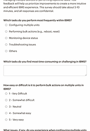

Surveys
User survey capturing quantitative data on pain points, usability gaps, and feature needs.


Support Tickets
Support ticket analysis revealing recurring issues and operational inefficiencies.
Navigating Stakeholder Alignment Challenges

Getting everyone aligned was not easy. Engineers wanted a more structured setup to reduce complexity, while leadership focused on scalability and ROI. The real challenge was proving that a better workflow could drive both operational and strategic impact.
Early conversations revealed a lack of alignment. Some pushed for quick fixes, while others called for a full overhaul. The question was not just what we were building, but why it mattered.
To unify the vision, I led stakeholder workshops that mapped user pain points to business goals. Engineers saw how structure could streamline their work. Leadership saw how guided setup and real time insights could scale impact. The new Pivot page, which combined Overview, Donor, and Service Unit views, helped turn that vision into reality.
After multiple iterations, we arrived at a shared solution: a more intuitive and efficient system that supported both usability and long term growth.


Optimal Solution Alignment
Shaping the Redesign Strategy
With stakeholder alignment established, the next step was translating insights into actionable UX improvements. By addressing inefficiencies and scalability challenges, I defined clear design objectives to guide the redesign process and kick off wireframing.
Key Objectives:
Clearer System Health, Smarter Oversight
Provide a centralized interface for engineers to monitor and manage multiple units more effectively.
Faster Issue Resolution Across Devices
Enable engineers to diagnose and resolve issues across multiple units faster with bulk troubleshooting tools.
Refinement: Proposed a unified dashboard combining system health, device status, and performance metrics into one view.
Refinement: Added a bulk troubleshooting tool on the Overview page to speed up multi-unit issue resolution.

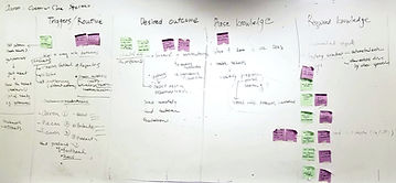

Mapping Key Opportunities
We visualized our problem space through a collaborative ideation session, clustering themes and defining key opportunities that would inform our next steps in wireframing and system architecture.
Design Evolution
Usability Enhancements & Iterations

Laying the Foundation with Wireframing
Before diving into high-fidelity designs, I began with low-fidelity wireframes to map out key workflows and validate core functionality. These early concepts allowed me to test navigation flows and interaction patterns without being tied down by visual details.
My goal was to ensure that the interface would support network engineers’ needs, streamlining multi-unit management without unnecessary complexity.
Refining the Pivot Overview Through User Insights


Variation 1

Variation 2

Variation 3


I explored multiple design variations of the Pivot Overview to determine the most effective content layout, navigation structure, and bulk action placement. The goal was to understand:
• Which information engineers found most beneficial
• How they expected to navigate between sub-units
• The optimal placement for the bulk action bar
These variations provided a starting point for discussions with stakeholders and users, allowing me to refine the design based on real-world needs rather than assumptions.
Testing Early Concepts: Finding the Gaps
When I first tested these early designs with network engineers, it became clear that while the functionality was present, the experience wasn’t as seamless as it needed to be. Observing how they interacted with the interface revealed crucial pain points:
Need for Real-Time Status at a Glance:
Engineers wanted to see overall device status and connectivity at a glance rather than toggling between screens.
Quick-Access Controls:
Routine tasks like rebooting, diagnostics, and updates needed to be more accessible without deep navigation.
Real-Time Monitoring Needs:
They emphasized the importance of real-time performance monitoring across all units, highlighting a gap in immediate visibility.
Map Overload:
Users found the map’s prominence distracting and preferred an on-demand option for a more streamlined experience.
This iterative process wasn’t just about refining visuals; it was about rethinking how engineers interact with complex data. By simplifying navigation, improving real-time visibility, and making controls more accessible, we transformed the Pivot Overview into a seamless, intuitive experience that better supports troubleshooting and large-scale deployments.
Bridging Creativity with Technical Precision
The Pivot 5G project thrived on tight collaboration between UX design and development. From research to launch, we worked in lockstep—aligning user needs with technical feasibility.
In the wireframing phase, I mapped user journeys while developers flagged performance risks early on. This back-and-forth continued through prototyping, where their insights streamlined complex interactions without sacrificing usability.
By the time we hit development, our designs were refined, scalable, and ready for pixel-perfect implementation. Post-launch, our continuous feedback loop ensured the product kept evolving, blending great UX with robust performance.
User Journey Mapping & Performance Insights
Mapping user journeys while integrating developer feedback to ensure performance and scalability from the start.

Centralized Documentation for Cross-Team Alignment
Using Confluence and Jira to keep design and development aligned on priorities throughout the project lifecycle.


Streamlined Workflow Delivery for Efficient Collaboration
Implementing structured workflows to minimize misunderstandings and reduce implementation errors.


Design System Updates for Consistency & Scalability
Updating UI components and patterns to ensure visual consistency and streamline future design efforts.


This proactive collaboration led to a seamless transition from design to development, keeping all stakeholders aligned and the project on track. The end result was a product that not only met user expectations but also achieved technical efficiency and scalability goals.
Bringing Objectives to Life
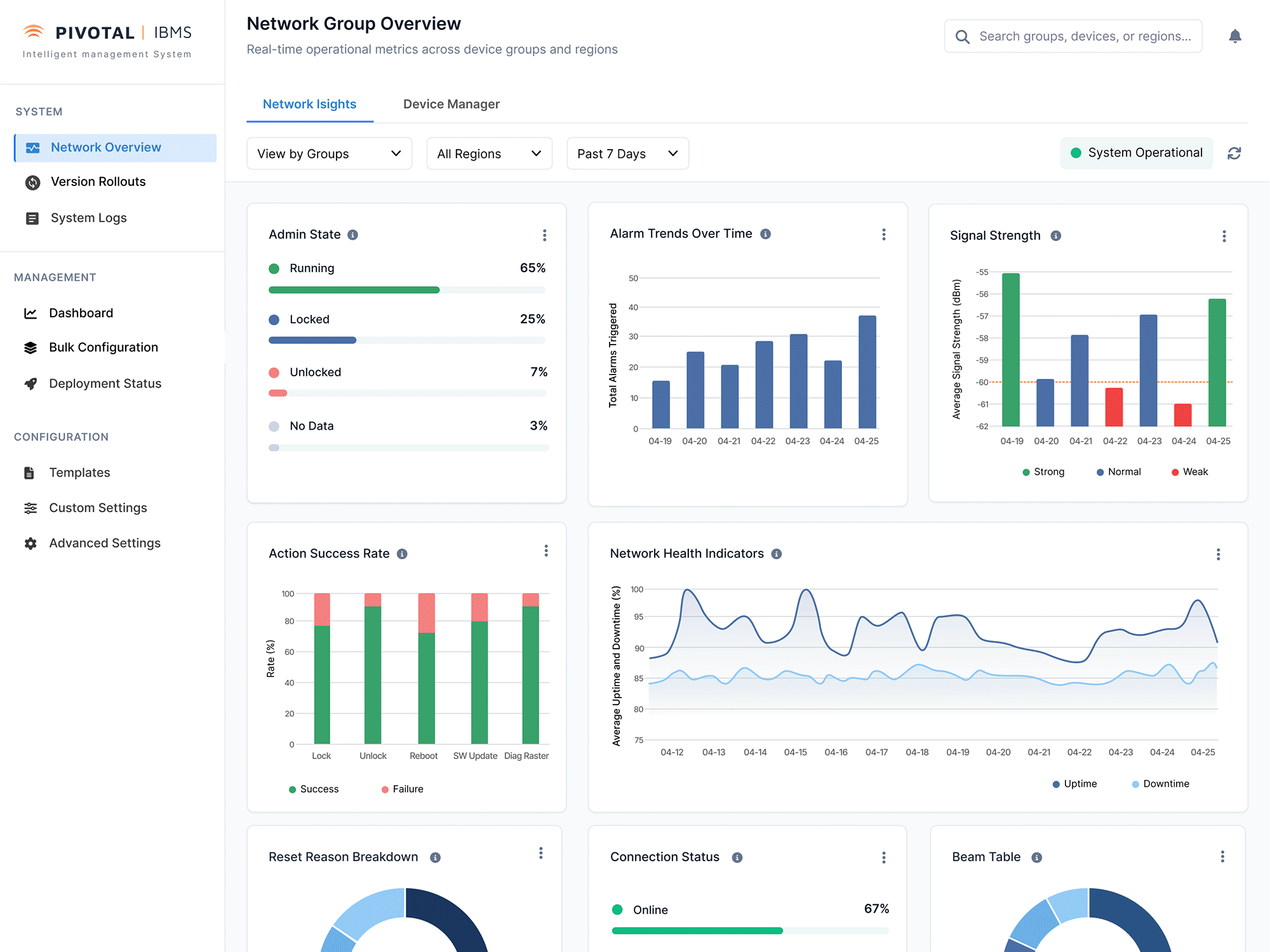
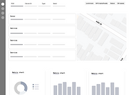
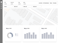
Pivot 5G Overview: A Clear View of the Network
Before:
Teams had limited visibility into device roles and hierarchy making it difficult to distinguish between donor and service units or understand how devices were grouped under each pivot. This led to inefficiencies in planning, troubleshooting, and system optimization.
After:
The new centralized view provides clear, structured access to all devices and their sub-units—enabling faster diagnostics, smarter decision-making, and more confident network management at scale.


Responsive Layouts Across Devices
Desktop

Tablet

Mobile

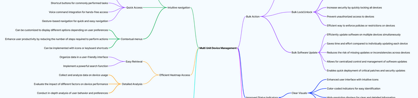
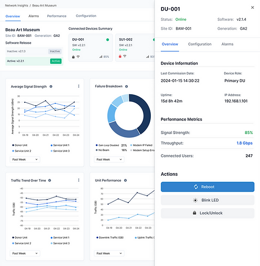
All-in-One Pivot Dashboard for Donor & Service Units
Before: Engineers had to jump between individual device pages (like DU-001 in the panel on the right) to investigate issues, manually cross-referencing logs without any centralized visibility. This fragmented approach slowed down troubleshooting and made it difficult to spot patterns or identify root causes.
After: I designed a unified Pivot-level dashboard (left and center panels) that aggregates Donor and Service Unit data into a single, holistic view. Engineers can now monitor performance, uptime, signal quality, and failure rates across all connected devices without context switching. Automated insights and one-click actions (like reboot or lock/unlock) are integrated directly into the UI, enabling faster diagnostics and more confident decisions.

Impact
75%
Increase In
System Visibility
The Pivot Overview dashboard gave engineers real-time insights, improving their ability to monitor and manage network performance.
35%
Increase In
Troubleshooting Speed
Redesigned Donor & Service Unit pages enabled quick access to critical data, significantly reducing issue resolution time.
42%
Increase In
User Satisfaction
User-centered design principles led to a smoother, more intuitive interface, resulting in overwhelmingly positive feedback from engineers.
52%
Reduction In
Support Tickets
Automated error detection and improved logging tools decreased the need for external support, freeing up engineering resources.
Data Collection and Analysis
User Feedback & Usability Testing:
We conducted multiple rounds of usability tests and surveys to gather direct feedback from engineers. This provided insights into how intuitive the new workflows were and helped identify remaining friction points.
Adoption Rates:
We measured how quickly engineers adopted new features like the Pivot Overview Dashboard and Beam Settings Panel by analyzing feature usage data collected through backend analytics.
Performance Metrics:
Using system logs and monitoring tools like Microsoft Azure (Azure Event Hubs and ADX, we tracked metrics like setup completion times, error rates, and manual task frequency before and after the redesign. These metrics helped quantify how much the new workflows improved efficiency.
Error Reduction & Troubleshooting Efficiency:
Post-launch, we tracked a decrease in support tickets and troubleshooting times, particularly around areas we streamlined, such as multi-unit management and configuration workflows
Cross-Functional Feedback Loops
Regular retrospectives with developers and product managers helped us collect qualitative insights on how the design impacted technical performance and team workflows.
Lesson Learned
Designing for Impact
As the lead UX designer on this project, I took full ownership of the design process. While I was about 75% satisfied at launch, I was proud of how we transformed a complex, technical tool into something more intuitive and scalable. We created a roadmap for future improvements, and the feedback loop we established continues to guide the next iterations.
Balancing User Needs with Technical Constraints
One major challenge was aligning user needs with technical and business priorities. Engineers focused on performance, while leadership emphasized scalability and ROI. I helped bridge these gaps through open communication, aligning user pain points with business goals to guide better decisions.
Proactive Developer Collaboration
We identified technical constraints early and built feedback loops into every phase—from wireframes to QA. This helped us keep the product technically sound without sacrificing usability.
Continuous Improvement Over Perfection
This project reminded me that UX is never done. We monitored feedback, tracked metrics, and continued evolving the product after launch. That mindset of ongoing refinement now shapes how I approach every project.