
Delta Dental
Find My Dentist
Delta Dental Washington kicked off a project to give their online healthcare provider finder tool a complete makeover.
The goal was to make the tool easier and more pleasant for users to navigate, ensure the information about providers was spot on, and beef up the search capabilities.

To respect my confidentiality agreement, I’ve obscured actual product screens to protect sensitive information. This case study reflects my own work and does not necessarily represent DDWA’s views.
The Challenge
The dentist search tool has been the most utilized tool on Delta Dental of Washington, yet its usability by customers ranked the lowest.
With many poor user feedbacks from online surveys and its customer service center, the company realized it had an urgent need to develop the better facilitate the customers' needs.
My Role
Partnered with a Researcher, Content Writer, and Product Manager for research and testing.
Developed sketches, wireframes, mockups, and provided final assets and documentation.
Managed development, ensured product accuracy, and led continuous improvement efforts.
Uncovering User Needs
Insights from Patient Testing and Feedback
User Testing
We already had a decent understanding of where our tool was falling short for users, thanks to a wealth of data from site surveys, feedback logs from our customer service center, and Google Analytics. But we knew we had to go further to really get into our users' heads.
Getting into user testing was an eye-opener. It was fascinating to see how people actually interacted with the system and to hear their thoughts and feedback directly.

User Interview
We interviewed 24 patients, really diving into their experiences to figure out why the current tool wasn't cutting it and what they were actually looking for in it. We talked about how they go about finding new dentists and what matters most to them in that search.
We also wanted to know if they felt like they were getting enough help from us to find the right dentist and if they were happy with the suggestions they ended up with. Plus, we asked them what they thought about the info we were giving them along the way.

Navigating Frustrations: User Challenges in Finding the Right Dentist
Finding the right dentist proved more difficult than users expected. Whether searching for a specialist or confirming if a provider was in-network, the process was filled with frustrating obstacles. Long lists of results lacked clear filtering, and the map view added confusion by failing to distinguish between multiple dentists at the same address.
Users also struggled with unclear driving directions and difficulty determining if dentists were accepting new patients. Most importantly, figuring out network coverage was harder than expected, leaving users disappointed by the gap between their expectations and the actual experience.
Challenges in Search Functionality
Overall, users really struggled to sift through the search process to find the right dentist for their needs.
Whether it was looking for a new dentist, a specialist, someone to treat a specific condition, or just figuring out if their dentist was in-network or out-of-network, it wasn’t as straightforward as it should have been.

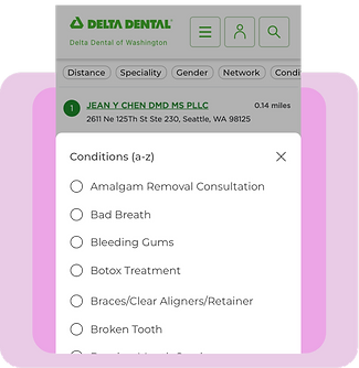
Unfiltered Results and Map Limitations
When users end up staring at a long list of results, figuring out what they're looking for can feel like searching for a needle in a haystack, especially without a clear way to sift through all the options. And then, when you try to spot dentists on the map, it gets even more confusing. The map doesn't show when there are several dentists at the same address, so it's like some of them just vanish into thin air.

Falling Short of Expectations
Users thought they were going to get full-on "driving directions," not just a sneak peek, and they wanted to know if dentists were open to taking new patients. The biggest thing on their list, though, was finding out whether a dentist was in their network, and that turned out to be trickier than expected.
But when they tried to dig up that key info, they hit a wall. This mismatch between what they hoped for and what they actually got was a bit of a letdown.

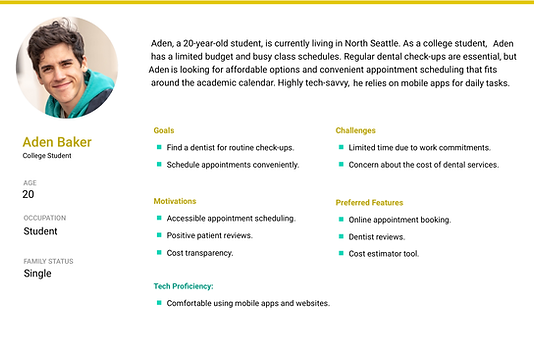
Guided by User Insights
As we dove into the redesign, we focused on the details of who our users are—their age, location, oral health needs, insurance, and tech-savviness. This wasn’t just data; it became a shared reference for our team, helping us understand our users’ world and guiding our decisions throughout the process.
Knowing exactly what users needed from the “Find My Dentist” tool was a turning point. It influenced everything from our user testing approach to prioritizing key features. No more guesswork—our goal was to create something that truly met users’ needs and made a real impact.


Competitive Analysis
Competitive research played a key role in shaping our redesign. By looking at what other companies were doing, we spotted features like better search filters and detailed provider profiles that our tool was missing. These insights helped us add the right improvements, making the tool more user-friendly and bringing it up to par with what users expected.

Rapid Prototyping
Enhancing the Search: Upgraded User-Friendly Features for Our "Find a Dentist" Tool.
Users provided valuable feedback that highlighted a few key areas for improvement. Accuracy in geo-location was one of them, as some users noticed it wasn’t always precise, which affected their ability to find nearby dentists. They also expressed interest in having more detailed reviews directly on the search page to simplify decision-making. Lastly, enhancing the map’s usability with smoother zooming and easier panning could significantly improve the overall experience.
Getting the Location Just Right
A few users mentioned that our geo-location could be a bit more accurate. It seems like it's not always spot-on with where they actually are. Tweaking this could make a big difference in helping people find what they're looking for, closer to where they really are.
Diving Deeper into Reviews:
Some patients are really keen on seeing more detailed reviews right from the search page. They'd love a way to get the scoop without having to navigate away, which could make deciding on a dentist much easier.
Making the Map More Fun to Use:
There were also suggestions to jazz up how the map works—think smoother zooming and easier panning. It sounds like these tweaks could make exploring results on the map a lot more enjoyable and user-friendly.

Design Solutions
Turning Opportunities into Goals
We laid out a plan to tackle the problems we found in the "Find My Dentist" tool, making sure it would become easier and more enjoyable for users to navigate.
Simplifying the Dentist Search: Focus on Proximity and Ease
The way we search for a dentist has really changed, putting a big focus on finding someone close by since most of us want a dentist who's just around the corner.
The whole interface is now a lot simpler, with just one search box where you can type in the name of a dentist or a clinic. It's made the whole process of finding a dentist much smoother and straightforward.
Direct Path to Dentist Details
We made the search experience slicker by removing the 'Advanced' search option. Instead, we wove the specialty and network categories right into the main search bar.
This tweak was all about keeping the search tool as trustworthy and useful as possible, making sure you can always find the latest on dentists - like who's available, what they offer, and how to get in touch. Updating this info is key to keeping your trust in the tool, ensuring it's always reliable when you need it.
The Impact of Auto-Suggestions on Finding Dentists
Adding auto-suggestions and as-you-type hints has been a game-changer. Now, finding the right dentist is faster and more straightforward for everyone.
It's been great to see how this little tweak has made such a big difference in helping users quickly zero in on what they're looking for, all while keeping their trust in the tool's reliability.


Enhanced Features for Easier Dental Care Navigation
We've really stepped up the game with our tool, making it even more user-friendly and helpful. Now, it's a breeze for users to check if their dentist is in the network or to hunt down specialists for whatever specific needs they might have. And to make getting to appointments less of a hassle, we've added a handy "driving directions" feature.
Plus, we've tweaked the search results to be clearer and more intuitive. If there are several dentists at the same address, you'll see numbers indicating just that. And to keep things simple, we've made the list view the standard way you'll see your search results. It's all about making the experience smoother and more straightforward for our users.
Impact
Key Improvements: Boosting Engagement and User Satisfaction
Recent updates led to major improvements: a 18% boost in engagement, 30% fewer customer service inquiries, 25% more appointment bookings, and a rise in positive feedback. These results highlight the success of a more intuitive interface and improved provider details.
18% Mobile Engagement Boost
This metric was reflected in both the number of searches conducted and the overall time users spent on the site, highlighting the effectiveness of a more intuitive interface and faster loading times.
30% Reduction in Customer Service Inquiries
This reduction underscores the direct impact of improved usability on operational efficiency, as users found it easier to navigate the tool and locate the information they needed without additional support.
25% Increase in Appointment Bookings
The value of providing thorough and accessible provider details in facilitating informed decision-making and boosting user confidence.
4.5 out of 5 Overall Satisfaction Score
The enhancement of provider profiles led to increased positive feedback from users, reflecting improved satisfaction with the tool's usability.
Reflection
What I have learned
Working on the redesign of the "Find a Dentist" tool taught me a lot. First off, really focusing on what users need and want made all the difference. It wasn't just about making things look good; it was about making them work better for the people using them.
I also saw how powerful data can be in guiding design choices. It's one thing to go with your gut, but having data back up decisions? Game-changer. And the collaboration across different teams brought so many perspectives and ideas to the table, enriching the whole process.
I was surprised by how much of an impact the tool's performance had on user satisfaction. It's clear now that if something's slow or clunky, people just won't want to use it. Being open to feedback and willing to tweak things along the way was crucial too. It's about creating something that really works for users, even if it means revisiting ideas or making changes after you thought you were done.
Making the tool accessible to everyone felt incredibly important and was a big learning curve. It's not just about reaching a wider audience; it's the right thing to do. And giving users detailed information about dentists really paid off. It turns out people really value having the information they need to make choices they feel good about.
Lastly, I learned that the work doesn't stop once the tool is launched. Watching how it performs and finding ways to improve it continuously is key. This project was a huge growth opportunity for me, shifting how I approach design in so many ways.