
Delta Dental
Patient Registration
Simplified user registration by integrating ID lookup into a single adaptive form. This redesign increased completion rates by 33%, reduced abandonment by 25%, boosted user satisfaction to 4 out of 5, and cut task completion time by 2 minutes.

To respect my confidentiality agreement, I’ve obscured actual product screens to protect sensitive information. This case study reflects my own work and does not necessarily represent DDWA’s views.
The Challenge
Online patient registration is crucial for the company, as it facilitates easy access to services, ensures accurate record-keeping, and enhances healthcare quality. Yet, the existing registration procedure has been plagued with significant abandonment rates and adverse user feedback.
There's a pressing need to simplify the signup process and effectively assist patients in completing their registration successfully.
My Role
I collaborated with a Researcher, a Content Writer, and a Product Manager, undertaking several rounds of research and user testing together.
My contributions included creating sketches, wireframes, and mockups, as well as providing the final assets and documentation.
I also oversaw the development process, checked the live product for accuracy, and engaged in numerous iterations for continuous improvement.
Uncovering User Needs
Insights from Patient Testing and Feedback
Analytics Review
After analyzing Delta Dental Washington's signup process, we discovered some key insights. Users were spending an average of 5 minutes on the signup page, but there was a noticeable 40% drop-off rate at the plan selection step, leading to an overall conversion rate of 25%.
Each month, we received approximately 150 calls regarding issues with the signup process. Although we were able to successfully resolve these issues in 70% of cases, it was evident that improvements were needed. Feedback from our surveys, which rated user satisfaction at 3 out of 5, highlighted that 30% of patients saw the requirement for a member ID as a significant hurdle.
Additionally, a substantial 40% of respondents suggested that simplifying the signup process would greatly enhance the user experience. This feedback points towards a clear need for streamlining and refining our approach to make signing up as seamless as possible.

User Testing
To get a genuine feel for how users interact with and perceive the current sites, we set up a series of user testing sessions. We wanted to cover a broad spectrum of experiences and opinions, so we reached out and got 35 participants from different corners of Washington state on board.
This wasn't just about numbers for us; it was about getting as wide a variety of insights as possible. Each session was designed to observe how real people navigated the sites, what challenges they faced, and what aspects they found intuitive or frustrating. This hands-on feedback was crucial—it gave us a clearer picture of where we stood and what needed change.
Users stumbling over ID number entry
Users had to enter their ID numbers all by themselves, and if they didn't, they couldn't finish signing up. Turns out, this was the main reason why a lot of folks were dropping out midway through the process.

Difficulties with creating passwords
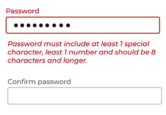
The password creation process presented complications due to unclear instructions and overly complex requirements. This resulted in users struggling to remember their passwords when attempting to sign in.
Too many required fields
Users were asked to complete an excessive number of form fields, with redundant information contributing to the high volume of mandatory fields.

Username retrieval difficulties
In the registration process, users had to create unique usernames, posing difficulties for returning users who frequently forgot their previously chosen unique identifiers

Rapid Prototyping
Our team engaged in numerous rapid wireframing iterations to ensure that we captured all user needs and assessed usability. This process not only guided us in communicating the design effectively to relevant stakeholders but also facilitated clear communication with the development team members.


Enhancements Through Multivariate User Testing
Removing the Road Block
After several brainstorming sessions with our team, we identified three potential workflows. We selected 48 customers from Washington State to represent each persona group for testing. Initially, we evaluated the first two options, A and B, both of which provided users with assistance in looking up their ID during the registration process.
The results indicated a preference for option B. Subsequently, we tested option B against option C, where the requirement for a member ID was entirely eliminated from the process. The conclusive tests revealed a strong user preference for option C.
.png)
While OPTION A and OPTION B provide users with the means to retrieve their ID numbers for use during the process, OPTION C eliminates the need for an ID altogether, allowing users to sidestep the inconvenience.
Password Creation Improvement
By displaying password requirements from the start and enabling users to reveal their passwords, we've enhanced the previously challenging experience of password creation. Most of users have shared that the process no longer feels bothersome.

Make the User ID Retrieval Easy
For returning users, we offer a simplified method to retrieve their usernames. By eliminating the need to search for a member ID as a prerequisite for username recovery, we've greatly enhanced the process of revisiting for our patients.
.png)
Optimizing User Journeys
Flow Diagram for Streamlined Process Implementation
After choosing the winning design, I created a flow to present to the development team and stakeholders. This diagram clearly demonstrated the streamlined process and highlighted its advantages for users.
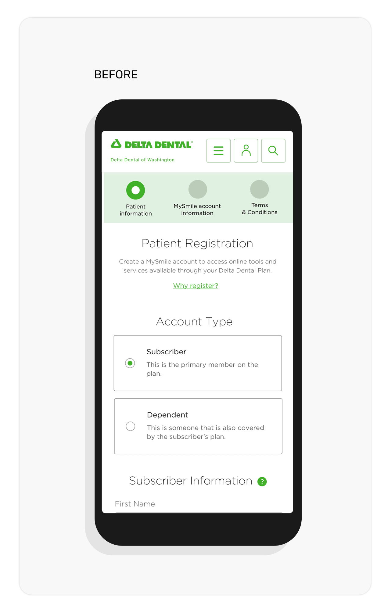
Before
Existing Registration Process: Challenges & Complexity
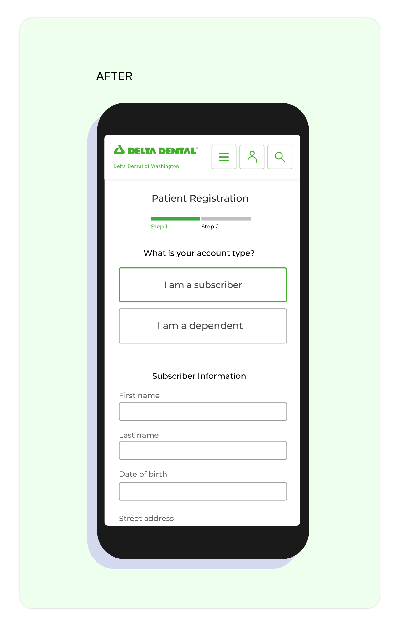
After
Optimized Registration Flow: A Simplified User Journey

Measuring the Impact
The redesign of the patient registration process brought about a noticeable shift in user experience. Before the changes, many patients struggled to complete their registrations, leading to high dropout rates and frustration. But with the new, simplified process, we saw a 33% increase in completion rates—patients were finally able to breeze through registration without hitting roadblocks.
The dropout rate fell to 25%, a clear sign that the changes were working. Patients were happier too, with satisfaction scores climbing to 4 out of 5. Perhaps the most telling outcome was the 25% drop in customer service calls related to registration, showing that users were finding the process much more intuitive and less frustrating. The redesign didn’t just improve numbers; it made a real difference in how patients accessed care.
Registration Completion Increased by 33%
More users successfully completed the process following the redesign.
User Satisfaction Improved
(4 out of 5 Rating)
Feedback surveys reflect a better user experience.
Dropout Rate Decreased to 25%
Fewer users abandoned the process midway.
Customer Service Calls Reduced by 25%
Users found the process clearer and needed less support.